 < Take a look at the ugly 8-story eye-sore rusty copper-clad nondescript box where city officials work - City Hall. It's a helluva site (read the sign) where this view of the backside usually escapes public notice. Formerly a failed-bank building from the 1970's Savings & Loan Crisis, it's a catastrophic edifice deserving demolition by a wrecking-ball in stark contrast to the International Design-Award Mesa Arts Center.
  Looking at it heading west into "downtown", the perspective on-the-ground doesn't look any better on the north side of Main Street at the intersection of Centennial Drive - Lost in translation: high-quality development + a general plan calling for “a recognizable city with a strong sense of place". In the original One-Square Mile Grid Plan this was intended for A Public Plaza on 10 acres.
 Take a look at another 180-degree angle just one block south from the 2nd Floor Observation Deck of the 2014 Real Estate Design Award-Winning Encore On First from a holistic perspective with both City Hall and the Mesa Arts Center in view . . . How's this for 'a sense of place'??? A run-down auto repair remnant with barbed-wire on a block wall that clearly sends the wrong message - that's if you happen to open your eyes and take a look.
__________________________________________________________________________
BLOGGER INSERT: Mesa-authentic Architecture direct from Salt Lake City???
Architect pans Mormon redevelopment project's 'look'
__________________________________________________________________________
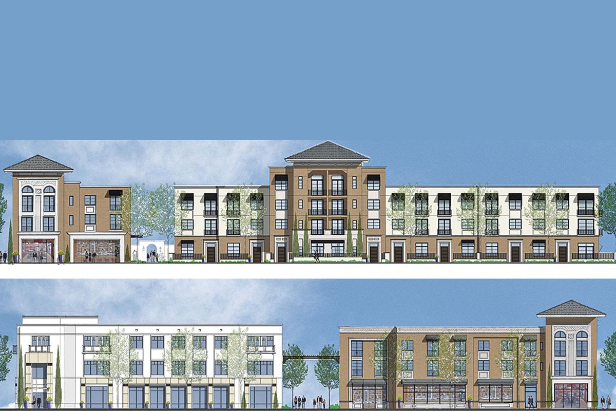
 BLOGGER INSERT: Schematic drawing for ASU@Mesa City Center > ?????? Where's that so-called "sense of place" High standards for architectural design? Nope.
__________________________________________________________________________
Here's a piece from Gary Nelson, long-time East Valley Tribune Contributing Writer who manages to fill up half of the front page with plans to begin giving the city a facelift.
Enough junky buildings, Mesa officials decide
"Back in the day when Mesa first appointed a citizens advisory panel to evaluate the appearance of new buildings in the city, they named it the Design Review Advisory Board.
The acronym – DRAB – may have been unfortunate, but city officials admit it could describe a lot of the architecture passing muster at City Hall over the years.
DRAB is now just the Design Review Board, but body and the city’s professional planning staff still don’t believe they have the tools they need to begin giving the city a facelift.
But it’s about to change. . .
> Commercial buildings now must “engage the street,” with parking hidden from passing traffic, and offer pedestrian-friendly environments
> Even large industrial buildings are covered, with provisions that, again, limit the amount of parking visible from nearby streets and requirements for a variety of building materials to create a pleasing palette
> “We are allowing the developers and builders to have some confidence they can come into Mesa and they can try something that’s working maybe on the East Coast or somewhere outside of Arizona,” [District 6 Councilmember Kevin Thompson] said
> Councilwoman Jen Duff said she wished the design guidelines went farther in eliminating confusing street patterns sometimes force people to drive when, with a different layout, they could walk to visit a neighbor or store.
- She also pushed for more stringent shade requirements and said planners should encourage more density, both to provide affordable housing and to curb sprawl.
- Density, Duff said, is not a bad word. “We have to think about density as a chosen way to live. It doesn’t necessarily mean lower quality,” she said.
The council is expected to approve the new design guidelines on Dec. 2, and the associated ordinance changes on Dec. 9.
Normally a new ordinance takes effect in 30 days, but developers asked for an extra month to gear up and the city agreed to have the new rules take effect on Feb. 10. Building plans submitted before then can still adhere to current guidelines.


