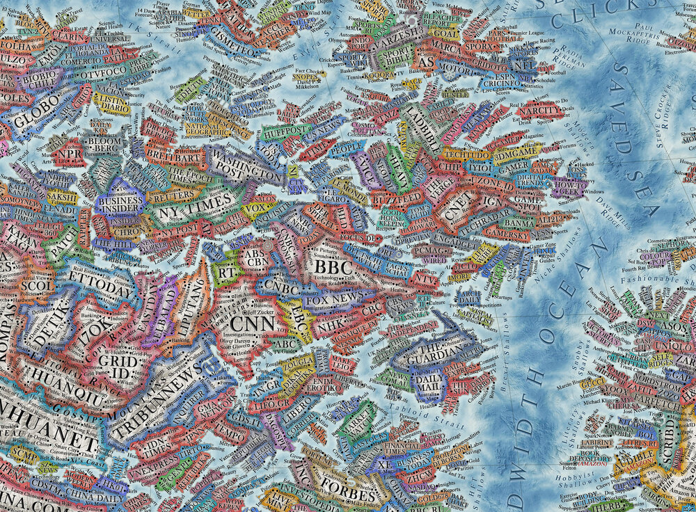
Harking back to historic cartography here's THE MAP OF INTERNET 2021 produced and published by Halcyon Maps.
Relative territorial sizes of websites on the main map are based on their average Alexa web traffic ranking between January 2020 and January 2021.
A narrative from Techdirt
Here's a thumbnail version, but you
really should go check out the full size version on Martin's website (or, better yet,
buy some prints of the whole thing).
Just the fact that looking at this smaller version above it's nearly impossible to read what most of the "countries" are should give you just a taste of how vast the non-big-tech part of the world wide web really is. There's a lot of "land" out there that isn't controlled by the big players, and we should be celebrating that. On his website he's got a few zoomed in examples as well, including the part that is my favorite: "Protocol Ocean."
Now some may quibble with various aspects of this. It's based on Alexa data, which isn't the most reliable, and it's only covering web traffic, which likely misses a lot of activity that is purely mobile these days. But still, when laid out this way, you really begin to get a sense of the diversity of the web.
Map Of The Internet Exposes The Lie That 'Big Tech' Controls The Internet
from the it's-a-wide-wide-world-wide-web dept
"To hear many people talk about things, the entire internet these days is controlled by just a few companies, mainly Google, Facebook, and Amazon. Depending on who you're talking to, you may hear them throw in companies like Netflix. But some of us keep pointing out that while those guys are big, that doesn't mean the rest of the internet stops existing. And it's still incredibly large. If you want this point really driven home, check out this amazing map of the 2021 internet by Martin Vargic (first spotted via Fast Company).
============================================================================
EXPLANATION:
> Compared to any previous iteration of the Map of the Internet, this new version is many times more detailed and informative. It includes several thousand of some of the most popular websites, represented as distinct "countries", which are grouped together with others of similar type or category, forming dozens of distinct clusters, regions and continents that stretch throughout the map, such as "news sites", "search engines", "social networks", "e-commerce", "adult entertainment", "file sharing", "software companies" and so much more. In the center of it all can be found ISPs and web browsers, which form the core and backbone of the internet as we know it, while the far south is the domain of the mysterious "dark web".
> Color schemes of websites are based on the dominant colors of their user interface or logo. To add further detail and provide deeper insight, many features and services provided by these websites, their sections and content categories, as well as distinct content creators, are labeled as cities and towns (which number at well over 10 thousand). Website founders and CEOs are represented as capital cities, while hundreds of the most popular users of social networks and celebrities can be found in the realms of Youtube, Facebook, or Twitter. Mountains, hills, seas and valleys represent a wide variety of aspects of the internet, its culture and computer science overall, while almost a hundred of some of the most important internet and computing pioneers are also featured on the map in the names of underwater ridges. > Surrounding the main map, the graphic also includes a large amount of supplemental information, including a ranking of the most popular websites, largest internet-related companies, list of major sites blocked in China or best-selling video games of all time, as well as several smaller maps of the real world, on internet-related topics, such as the share of population using the internet, cost and speed of broadband, levels of internet censorship and the most popular social network by country.
_____________________________________________________________________________________
". . .In the coming years, the relative popularity of sites bound to gradually change, some of the old sites will be shut down as new sites take their place, so this map can provide an unprecedented visualization to the future generations of how internet used to be. Since its inception in 1989, the internet has been in a state of continuous flux as millions of different sites emerged and then fell by the wayside. From this initial chaos, many major corporate players have emerged over the decades, and have since become dominant in heir respective niches. This trend has been especially evident in the last decade, as Google, Youtube, Amazon and Facebook have far outgrown or absorbed most of their previous competition on an international global scale. Increasingly, this has led to mounting accusations of monopolistic behavior, censorship and misuse of user data.

This work was originally inspired by the “Map of Online Communities“ by Randall Munroe, and further by my own maps of the internet 1.0, 2.0 and 3.0 previously published in 2014-2015."


No comments:
Post a Comment